Đề ngày 20/6/2020 (đề này được đánh giá là một đề khó)
Sample answer
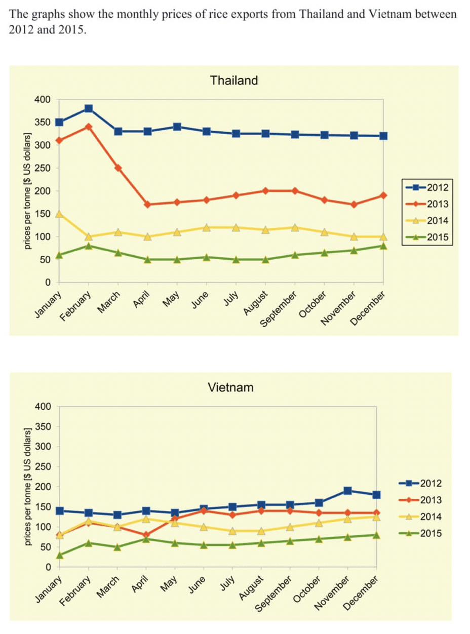
The two line graphs give information about how prices of exported rice from Vietnam and Thailand changed every month from 2012 to 2015.
Overall, 2012 and 2013 were the years in which rice exports from the two countries were sold at higher prices compared with the later years. In addition, the monthly price of rice exported from Thailand was generally higher than the figure for Vietnam’s rice exports in each year given.
Looking at the year 2012, it is clear that rice exported from Thailand was sold at $US 350 per tonne in January, over two times the price of rice exports from Vietnam. After peaking at $US 375 per tonne in February, the price of rice exports from Thailand stabilized at around $US 340 per tonne until the end of the year. Meanwhile, the figure for rice exported from Vietnam showed a slight increase, reaching $US 175 per tonne in December 2012. Throughout the year 2013, at the same time that the rate of rice exported from Vietnam rose from $US 75 to under $US 150 per tonne, rice exports from Thailand witnessed a dramatic fall in selling prices from January to April, dropping from $US 300 to around $US 175 per tonne, before recovering to $US 200 over the remaining months.
In 2014, the price of rice exported from Thailand decreased marginally from $US 150 to $US 100 per tonne, while the figure for rice exports from Vietnam revealed an opposite pattern, climbing gradually from $US 75 to $US 120 per tonne. A similar upward trend in the price of rice exports from both countries was clearly seen in the year 2015. Specifically, rice exported from Thailand and Vietnam cost over $US 50 and around $US 25 per tonne in January, but later the prices went on with an increase of approximately $US 30 in both nations.